How to Create Eye-Catching Designs for Your Product Boxes?
Picture this: You're standing in a crowded retail store, facing shelves packed with hundreds of similar products. Your eyes dart from one package to another, but only a few truly capture your attention. What makes these product boxes stand out while others fade into the background? The answer lies in eye-catching design that transforms ordinary packaging into powerful marketing tools. Creating visually compelling product boxes isn't just about aesthetics—it's about crafting an immediate emotional connection that drives purchasing decisions and builds lasting brand loyalty in today's competitive marketplace.

Understanding the Psychology Behind Product Box Design
The human brain processes visual information incredibly quickly, making first impressions within milliseconds of seeing your product boxes. This psychological phenomenon explains why understanding consumer behavior is crucial when designing packaging that captures attention and drives sales. Eye-tracking studies reveal that shoppers typically scan products from left to right and top to bottom, spending only 3-7 seconds evaluating each item before making a decision. Color psychology plays a fundamental role in how consumers perceive your product boxes. Warm colors like red and orange create urgency and excitement, while cool blues and greens convey trust and reliability. Premium brands often utilize black, gold, or silver to communicate luxury and sophistication. The strategic use of contrast ensures your product boxes stand out on crowded shelves, while complementary color schemes create visual harmony that appeals to the subconscious mind.
-
Visual Hierarchy and Consumer Attention
Establishing clear visual hierarchy guides customers through your product boxes' information in a logical sequence. The most important elements—typically your brand name and product image—should dominate the design, followed by secondary information like features and benefits. Typography choices significantly impact readability and brand perception, with serif fonts suggesting tradition and reliability, while sans-serif fonts convey modernity and cleanliness. The strategic placement of these elements creates a natural flow that leads consumers from initial attraction to purchase consideration.
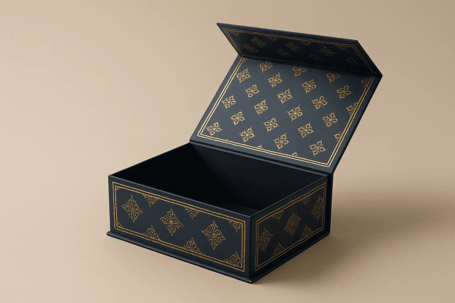
Essential Design Principles for Attractive Product Boxes
Successful product boxes balance multiple design elements to create cohesive, compelling packaging that resonates with target audiences. The principle of simplicity often proves most effective, as cluttered designs confuse consumers and dilute brand messages. Clean lines and minimal graphics ensure your packaging clearly states what the product is and what it does, while strategic white space allows important elements to breathe and command attention. Proportion and scale create visual balance within your product boxes, ensuring no single element overwhelms others unless intentionally designed for emphasis. The golden ratio—approximately 1:1.618—appears throughout nature and can guide pleasing proportional relationships in packaging design. Alignment creates order and professionalism, whether using symmetrical layouts for traditional appeal or asymmetrical arrangements for dynamic energy.
-
Material Selection and Structural Innovation
The choice of materials significantly impacts both the visual appeal and functionality of your product boxes. Premium paperboards like SBS C1S provide exceptional printing surfaces that support vibrant colors and fine details, making them ideal for luxury cosmetics and personal care products. The bright white appearance and smooth coating deliver superior print quality while maintaining structural integrity throughout the supply chain. For brands seeking sustainable options, Brown Kraft materials offer natural, earthy aesthetics that align with eco-conscious consumer preferences. The unbleached wood pulp retains its characteristic brown color and visible fiber texture, creating authentic, handcrafted appeal that resonates with organic and artisanal brands. These materials support various finishing techniques while maintaining cost-effectiveness for high-volume production runs.
Advanced Printing Techniques for Product Box Enhancement
Modern printing technologies enable sophisticated visual effects that transform ordinary product boxes into premium packaging experiences. CMYK printing processes accurately reproduce full-color images and smooth gradients, making them perfect for photographic elements and complex artwork. This versatile system efficiently handles large-volume print runs while maintaining consistent quality across entire production batches. Pantone Matching System (PMS) ensures precise brand color reproduction, critical for maintaining consistent visual identity across all marketing materials. The standardized ink formulas guarantee exact color matching regardless of production location or timing, essential for brands with strict color requirements. Specialty Pantone inks include metallic and fluorescent options that create unique visual effects impossible to achieve with standard CMYK processes.
-
Surface Finishing Options for Premium Appeal
Surface finishing techniques add tactile dimensions that enhance the perceived value of your product boxes. UV coating creates high-gloss surfaces that intensify colors and provide protection against moisture and handling damage. Spot UV applications highlight specific design elements like logos or product names, creating striking contrast between glossy and matte surfaces. Cold foil stamping applies metallic finishes without heat, enabling integration with digital printing processes for cost-effective premium effects. Hot foil stamping delivers more intense metallic appearances and supports intricate detail reproduction, ideal for luxury brands requiring exceptional visual impact. Embossing creates raised surfaces that invite touch while adding dimensional interest to otherwise flat packaging designs.
Strategic Brand Integration in Product Box Design
Your product boxes serve as three-dimensional brand ambassadors that communicate company values and personality at every customer touchpoint. Consistent brand integration goes beyond simply placing logos on packaging—it involves thoughtful application of brand colors, typography, imagery, and messaging that reinforces brand positioning. Every design decision should align with your broader marketing strategy and target audience expectations. Brand storytelling through packaging design creates emotional connections that transcend functional product benefits. Premium brands often incorporate subtle design elements that reference company heritage, manufacturing processes, or ingredient sourcing. These narrative details transform product boxes into conversation pieces that customers enjoy sharing on social media platforms, extending your marketing reach organically.
-
Differentiation Through Unique Design Elements
Market differentiation requires packaging designs that clearly distinguish your products from competitors while remaining authentic to your brand identity. Innovative structural designs, unique opening experiences, or unexpected material combinations can create memorable unboxing moments that generate positive customer experiences. Consider how your product boxes will appear in various retail environments, from traditional store shelves to e-commerce photography and social media content. Die-cut windows strategically reveal product contents while maintaining package integrity, building customer confidence through transparency. Custom shapes that reflect product attributes or brand personality create instant recognition and shelf presence. However, unusual formats must balance creative impact with practical considerations including shipping efficiency, storage requirements, and manufacturing costs.
Color Theory and Typography for Maximum Impact
Color selection profoundly influences consumer perception and purchase behavior, making it one of the most critical decisions in product box design. Research indicates that color increases brand recognition by up to 80%, while inappropriate color choices can damage brand credibility and reduce sales performance. Understanding color meanings across different cultures becomes essential for brands targeting diverse markets or planning international expansion. Typography serves as the voice of your brand, communicating personality traits through font selection, sizing, and placement. Script fonts suggest elegance and craftsmanship, while bold sans-serif options convey strength and reliability. The hierarchy of typographic elements guides reader attention and ensures critical information receives appropriate emphasis. Legibility remains paramount, as beautiful fonts that customers cannot read fail to communicate effectively.
-
Cultural Considerations in Global Markets
International markets require careful consideration of cultural color associations and reading patterns that may differ from domestic preferences. Red symbolizes luck and prosperity in Asian cultures but can represent danger or warning in Western contexts. Reading patterns vary between left-to-right, right-to-left, and top-to-bottom orientations, affecting optimal information placement within your product boxes. Religious and cultural sensitivities may restrict certain imagery or color combinations in specific markets, requiring localized design variations while maintaining overall brand consistency. Working with local design experts ensures cultural appropriateness while preserving brand integrity across global product launches.
Sustainability and Eco-Friendly Design Approaches
Environmental consciousness increasingly influences consumer purchasing decisions, making sustainable packaging design a competitive advantage rather than optional consideration. FSC-certified materials demonstrate commitment to responsible forest management, while recyclable substrates like CCNB support circular economy principles. These eco-friendly choices often provide cost benefits through reduced material expenses and simplified waste management processes. Sustainable design extends beyond material selection to include structural optimization that minimizes waste while maintaining product protection. Right-sizing packaging reduces shipping costs and environmental impact while improving storage efficiency throughout the supply chain. Water-based inks and adhesives eliminate toxic chemicals while supporting recycling processes, ensuring your product boxes contribute to rather than detract from environmental goals.
-
Communicating Environmental Benefits
Clearly communicating sustainability efforts through packaging design helps environmentally conscious consumers make informed choices. Subtle green design elements, recycling symbols, or brief sustainability messages can highlight eco-friendly features without overwhelming primary product information. Transparency about material sources and end-of-life disposal options builds trust and demonstrates genuine environmental commitment. However, avoid "greenwashing" by ensuring all sustainability claims are accurate and verifiable. Consumers increasingly scrutinize environmental promises, and false claims can severely damage brand reputation. Partner with certified suppliers and maintain detailed documentation supporting all sustainability assertions made on your product boxes.
Conclusion
Creating eye-catching designs for your product boxes requires balancing artistic creativity with strategic marketing objectives, technical production constraints, and consumer psychology. Successful packaging captures attention within seconds while communicating brand values and product benefits that drive purchasing decisions. By implementing these design principles and leveraging advanced printing techniques, your product boxes transform from simple containers into powerful marketing assets that differentiate your brand in competitive markets.
Cooperate with GUANGZHOU FETCHING COLOR PRINTING & PACKAGING LTD.
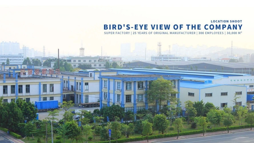
As a leading China Product Boxes manufacturer with over 25 years of experience, GUANGZHOU FETCHING COLOR PRINTING & PACKAGING LTD. combines advanced technology with expert craftsmanship to deliver exceptional packaging solutions. Our 50,000㎡ facility houses industry-leading equipment including KBA106-(9+1) UV printing machines and Heidelberg XL162-6L presses, enabling us to produce high-quality Product Boxes that exceed client expectations. With over 300 skilled employees and certifications including ISO9001-2015 and FSC, we serve as your trusted China Product Boxes supplier for cosmetics, electronics, food, and personal care industries.
Our comprehensive R&D team of ten packaging engineers provides specialized services in material applications, structural development, and artwork design, ensuring your Product Boxes achieve maximum market impact. As a premier China Product Boxes wholesale provider, we offer competitive Product Boxes price points while maintaining exceptional quality standards. Whether you need high-quality Product Boxes for sale or custom solutions, our proven production processes deliver superior results that build brand recognition and customer loyalty. Contact us at public@fetchingprinting.com to discover how our expertise transforms your packaging vision into reality.
FAQ
Q: What printing techniques create the most eye-catching effects on product boxes?
A: UV coating, foil stamping, and embossing create premium visual and tactile effects that significantly enhance shelf appeal and perceived product value.
Q: How do color choices impact consumer purchasing decisions for product boxes?
A: Colors influence emotions and perceptions, with warm colors creating urgency while cool colors convey trust, directly affecting purchase likelihood and brand recognition.
Q: What materials provide the best balance of print quality and cost-effectiveness for product boxes?
A: SBS C1S offers excellent print surfaces for premium applications, while CCNB provides cost-effective solutions with good print quality for budget-conscious projects.
Q: How can sustainable packaging design enhance brand reputation without sacrificing visual appeal?
A: FSC-certified materials and water-based inks maintain high-quality aesthetics while demonstrating environmental responsibility that resonates with conscious consumers.
References
1. "Packaging Design Psychology: How Colors and Shapes Influence Consumer Behavior" - Dr. Sarah Mitchell, Journal of Consumer Psychology
2. "Sustainable Packaging Solutions: Balancing Environmental Impact with Marketing Effectiveness" - Robert Chen, International Packaging Review
3. "Advanced Printing Technologies for Premium Packaging Applications" - Lisa Thompson, Packaging Technology Quarterly
4. "Global Packaging Design Trends and Cultural Considerations" - Maria Rodriguez, Worldwide Marketing Communications

Based on your location and order quantity, you will have the opportunity to receive a limited time free shipping promotion!
Corporate Purpose